Process
The rebrand began with a foundational audit of Mona’s existing assets and touchpoints. We identified what was working—her relational approach, inviting color choices, and an emphasis on personal growth—while clarifying what was missing: a distinct mark, messaging hierarchy, and an organized design system.
From there, I worked to:
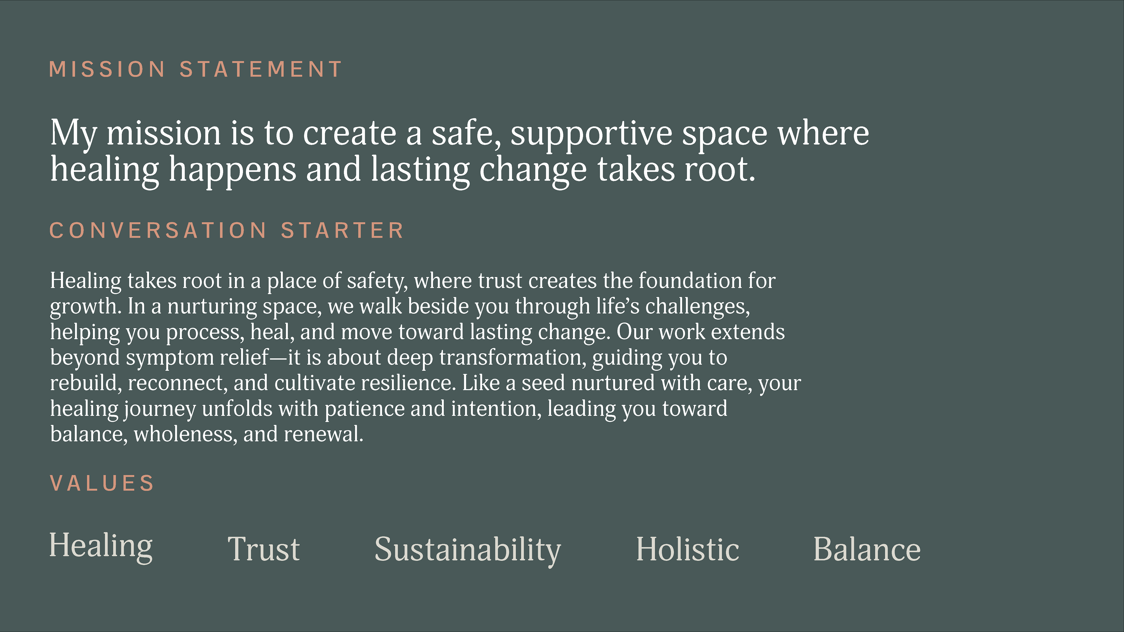
• Define brand pillars and refine messaging to be clear, empathetic, and professional.
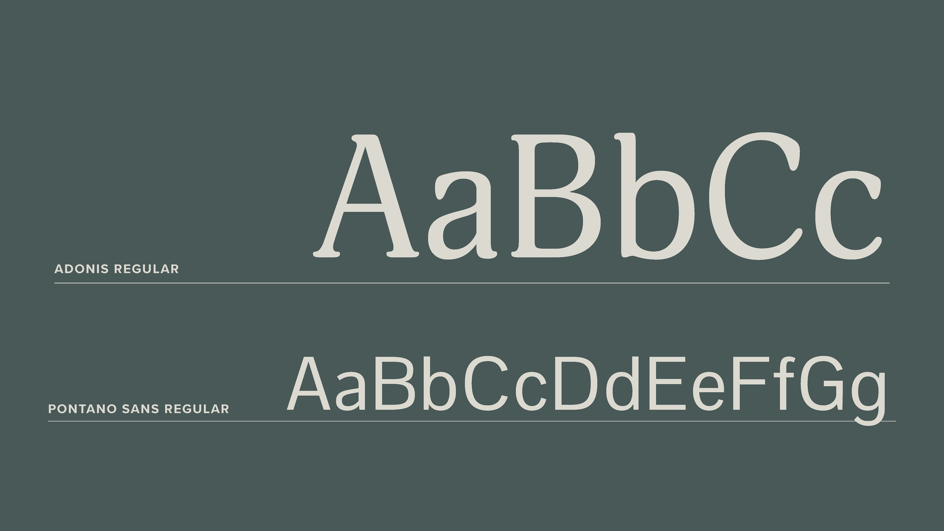
• Establish a consistent visual system including typography, color, and image direction.
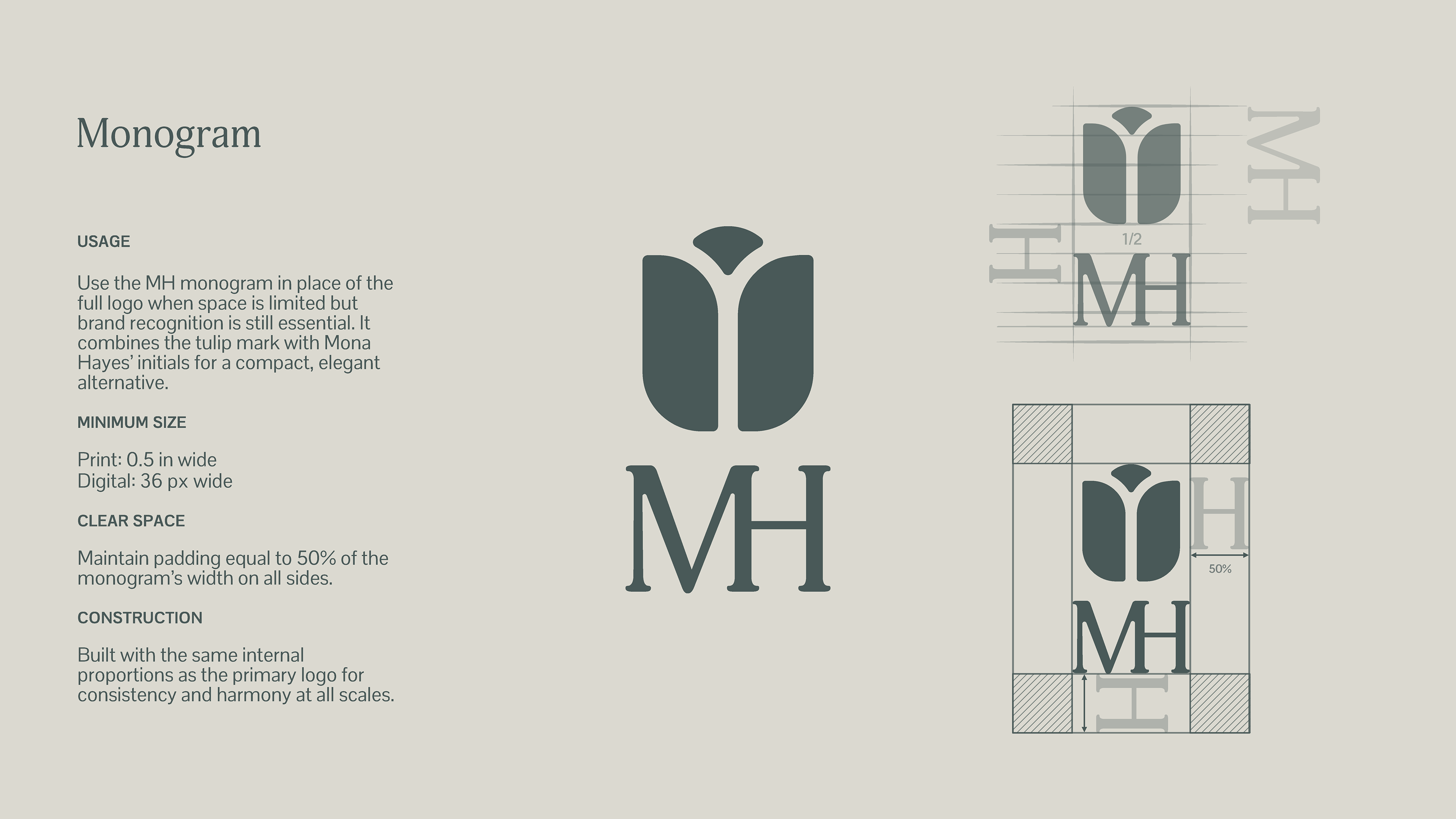
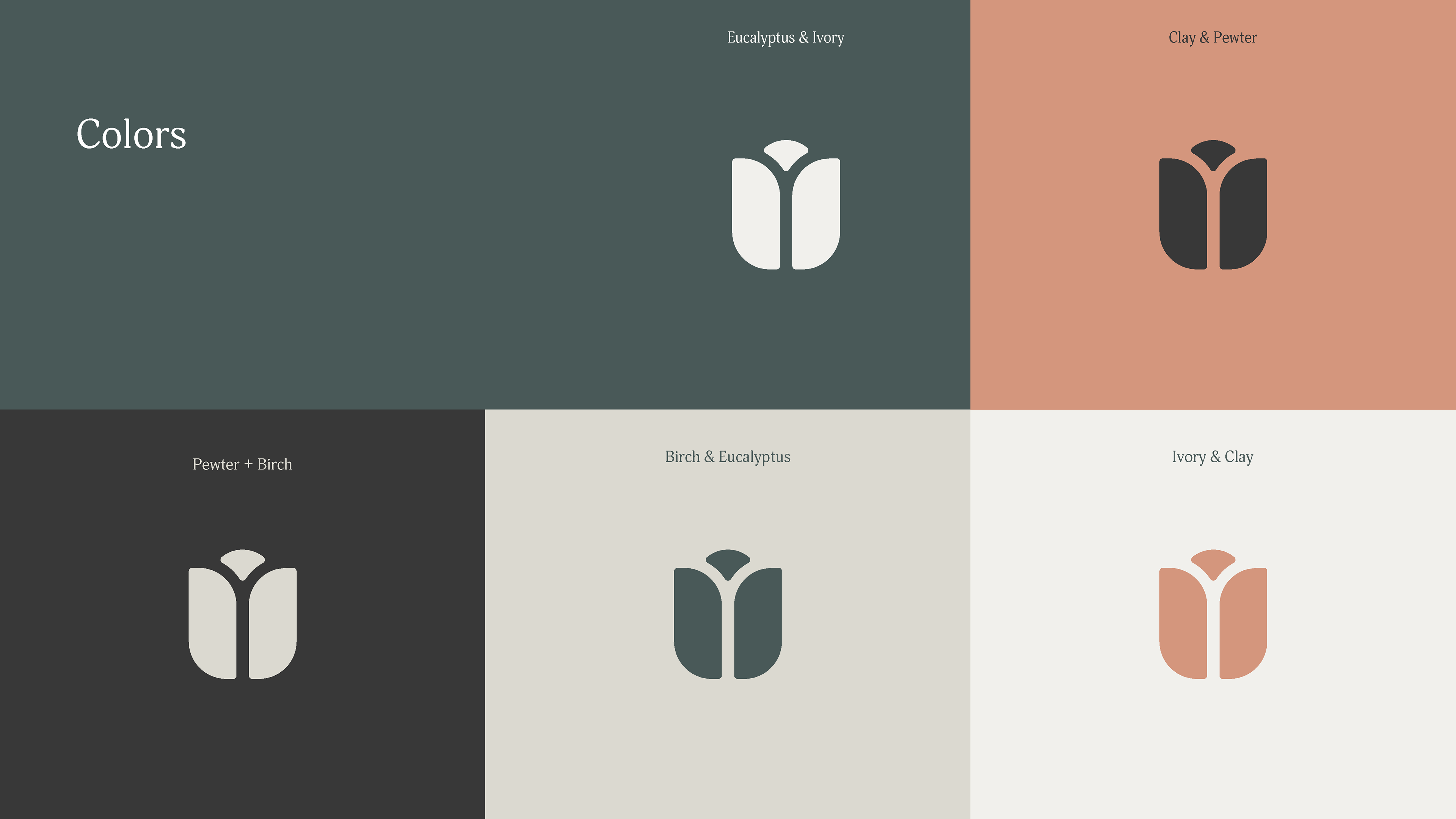
• Design a new logo rooted in symbolism, supported by rational storytelling.
The process was collaborative, with checkpoints to refine direction and ensure the identity felt authentic to Mona’s practice.
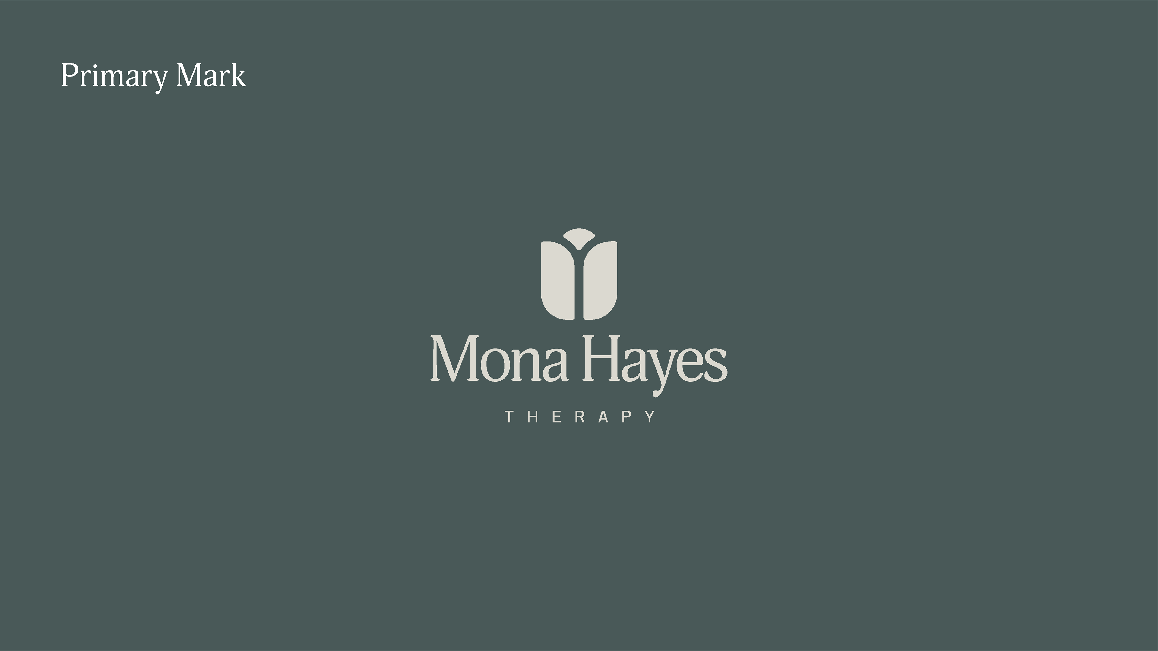
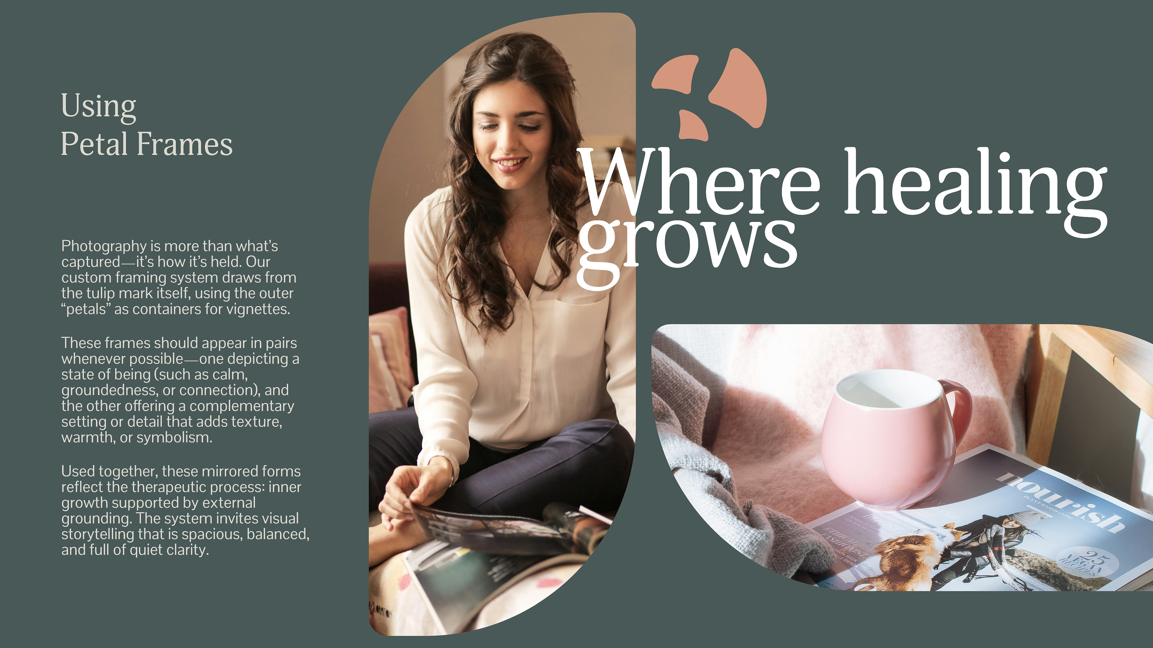
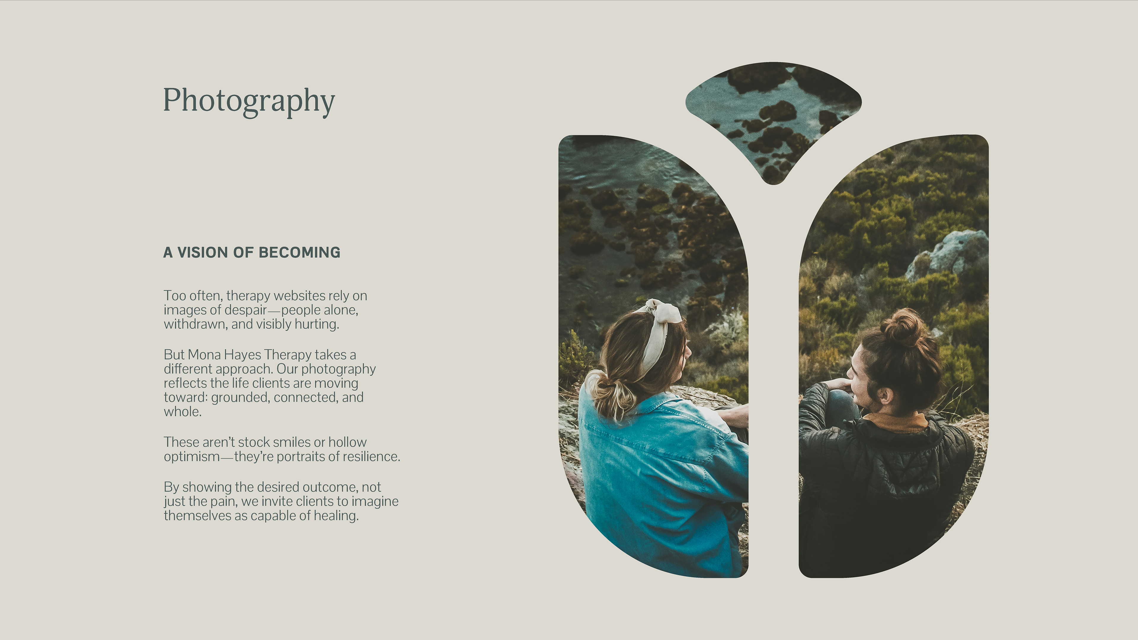
Mark Rationale
The chosen logo is a stylized tulip. The tulip represents growth and beauty, two qualities central to the therapeutic journey. Its form is constructed from three elements that split like a forked path, symbolizing the choices we make and the outcomes that shape our lives. Together, the mark communicates hope, resilience, and the transformative potential of counseling.
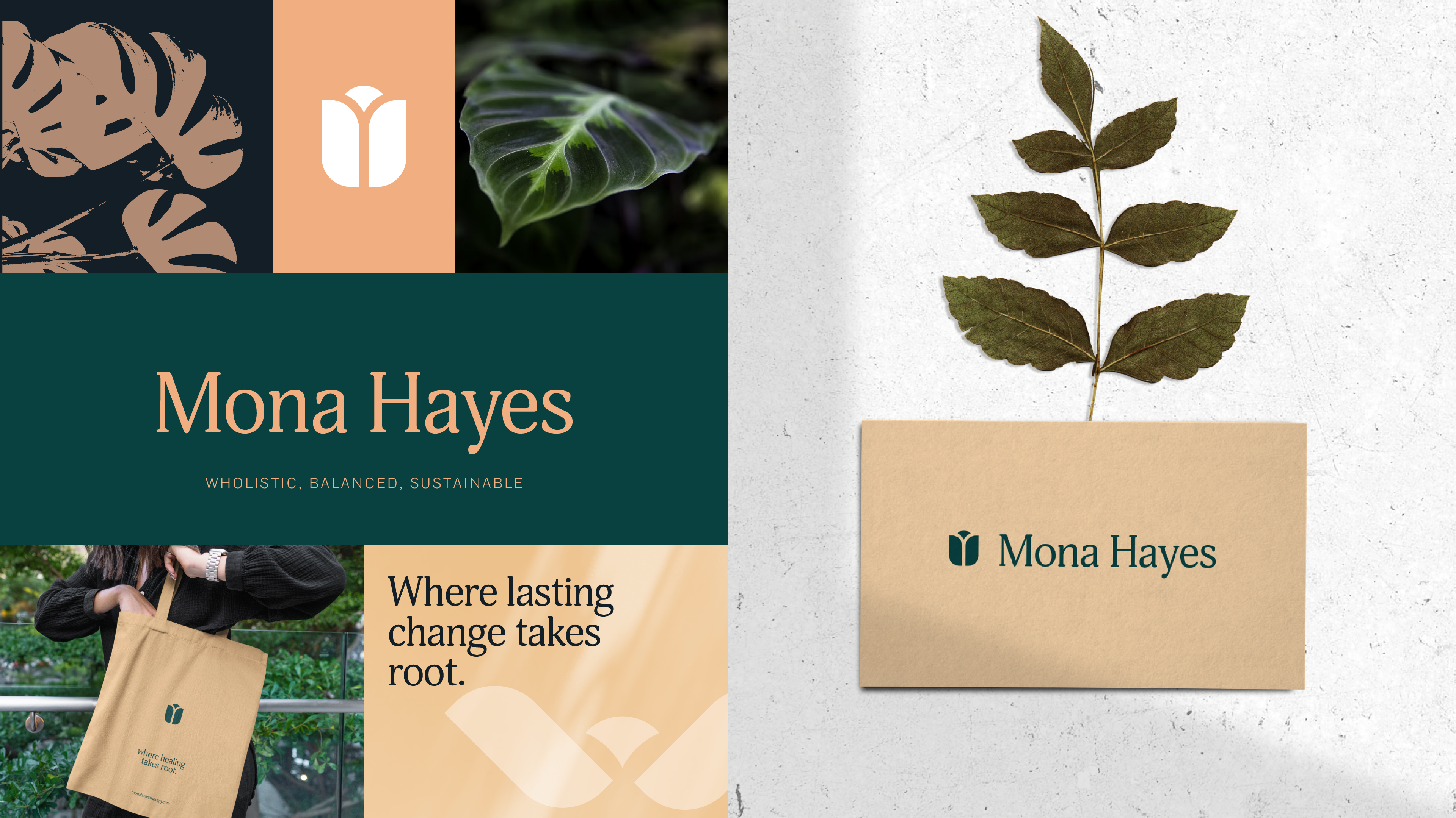
Outcome
The result is a refined and cohesive brand identity that aligns with Mona’s vision and communicates trust, beauty, and growth. The new mark, paired with a clear messaging framework and visual system, positions her practice for greater recognition and resonance with clients.