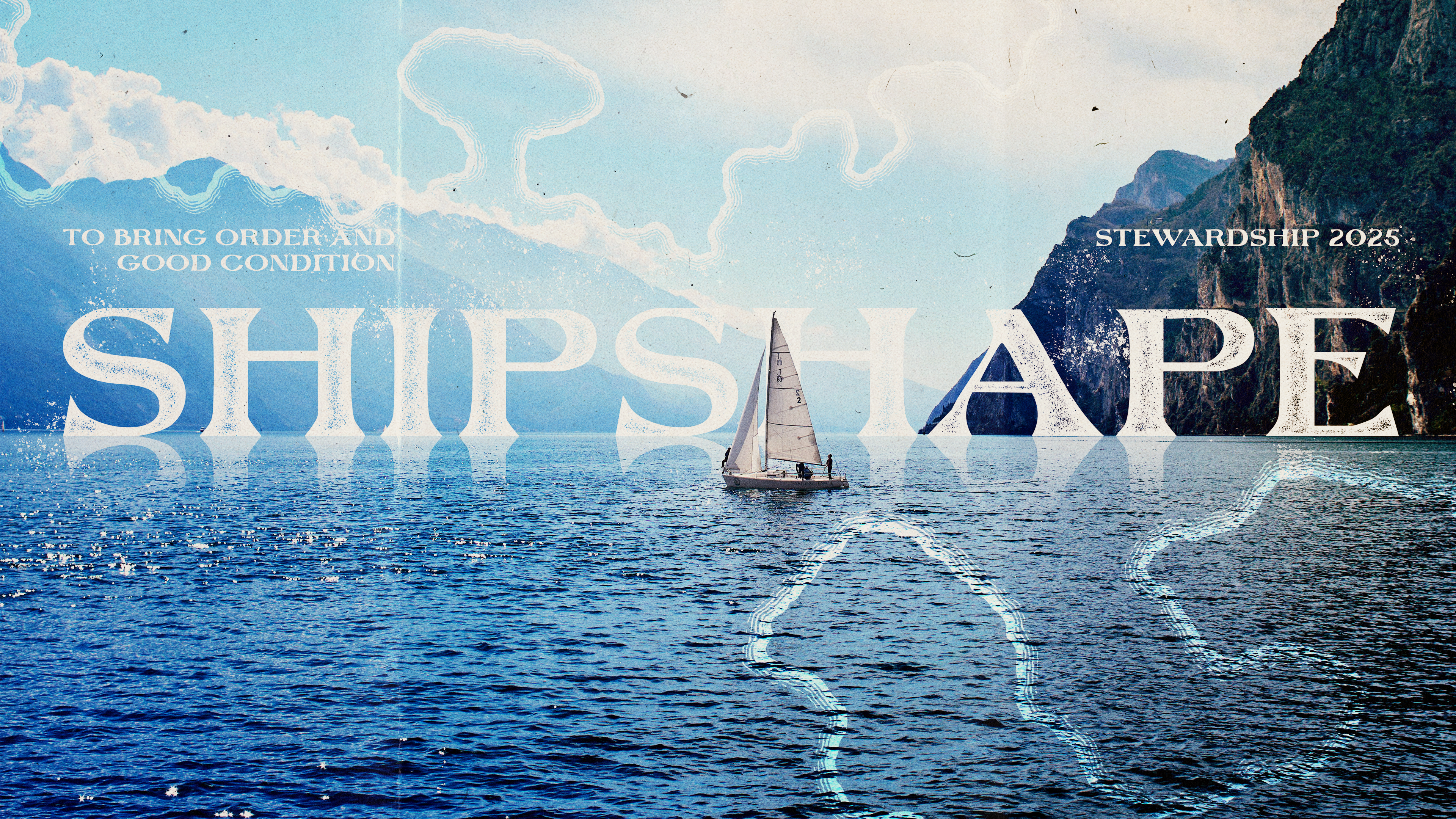
You don't always get a say in all creative decisions...such as the name and theme of a series. Regardless, the challenge was capturing both without leaning too "ahoy, matey." The photo is a composite. The type is set behind the sailboat and is a custom modified version of Keel, roughened with one of my brush sets. I made a custom displacement map to help create a more realistic reflection on the water. Around the edges we've got my vectorized recreation of an ink drawing from an old seafaring map.
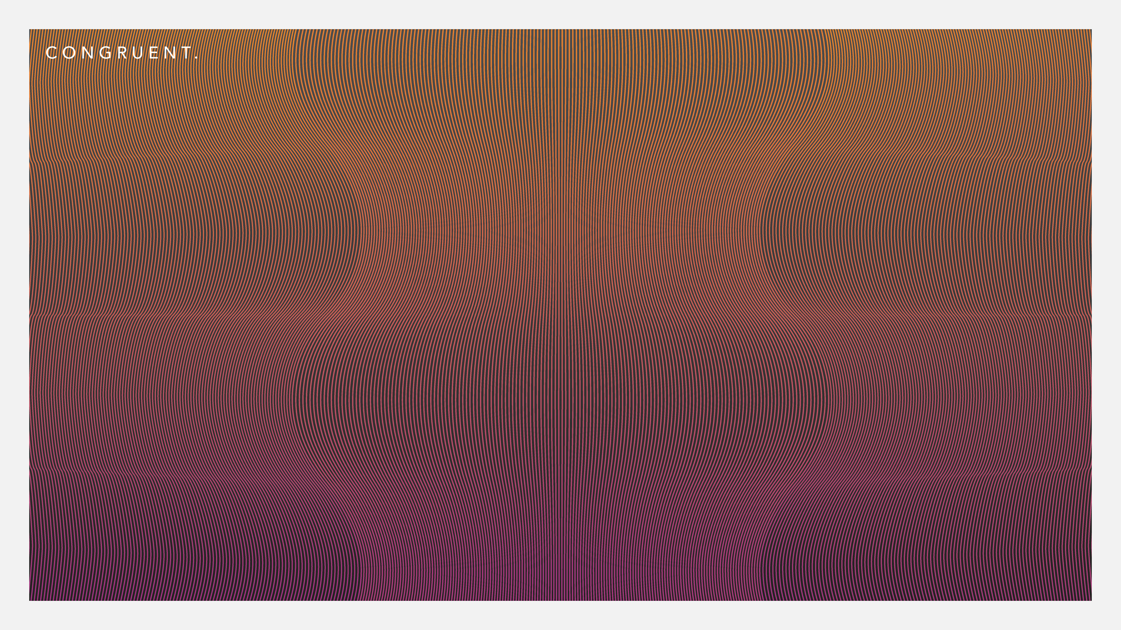
At the time I had recently discovered the blend tool in Ai. Clearly. I was looking for an excuse to push it and see how I could manipulate color and form and ended up really digging a number of variations—this one was the chosen design.
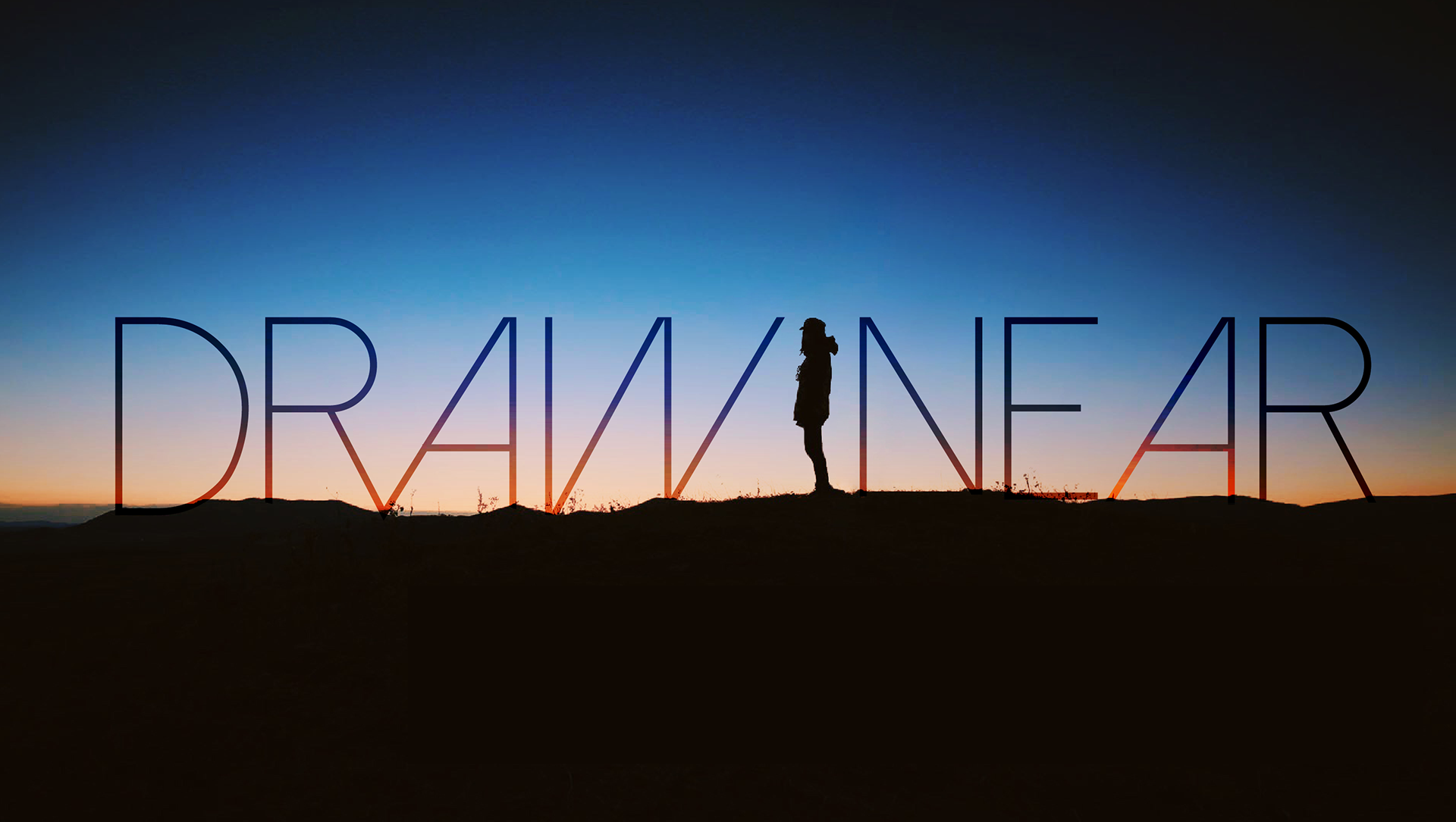
I like to think I came out of the gate strong. This was one of my very first designs at my first church job. Draw Near was an evening of worship and prayer and they needed to give it a new look. I chose a typeface that literally drew near to itself with those leaning A's and I wanted to convey that alone-with-God dynamic by getting the type to play with the figure. The original photo had the figure way off to the left or something so I brought it into Ps and moved it (easily done thanks to the silhouette look) to sit neatly between the two words. I managed to get the type to pick up some of that sunset look without (without it turning into cheesy WordArt...) by using some blending mode trickery with multiple layers set to different blend modes and opacities.
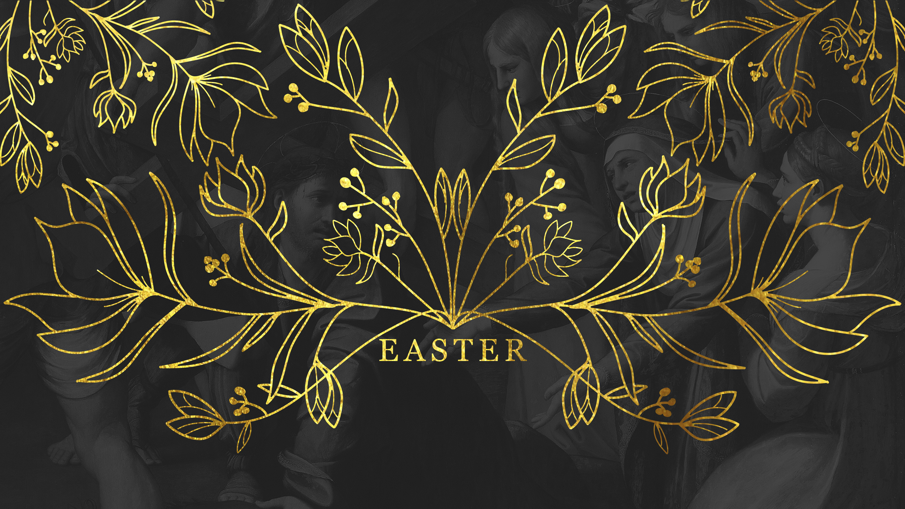
The year I got my first iPad Pro, I was looking for a way to mix it into my workflow. At the time, Procreate was still pretty new, Affinity hadn't hit the iPad scene yet, and Adobe had only the most rudimentary tablet version of their apps. Procreate was the tool of choice by a long shot. I did 90% of this in Procreate, in fact, including the lettering. I remember how disappointed I was with the Easter type when it was done—the lettering looked so clean that I might as well have saved myself the time and just typed it! Even if no one else could tell, at least I knew I hand-drew it...
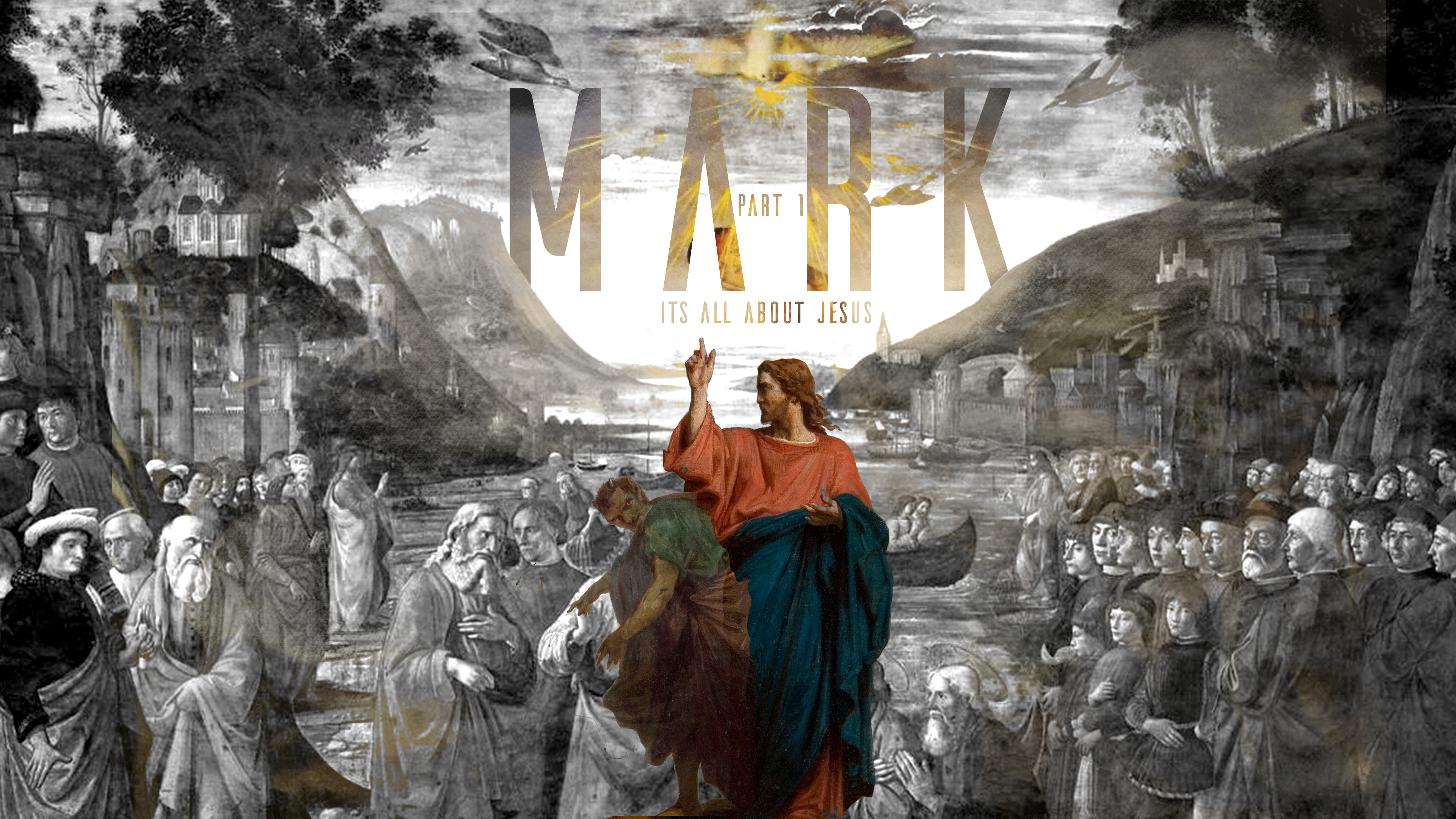
This one was a composite of maybe seven (?) classic baroque paintings that I layered together in order to recreate a scene out of the book of Mark while also incorporating a little playful tongue-in-cheek imagery: Jesus pointing to his own byline while side-eyeing Satan.
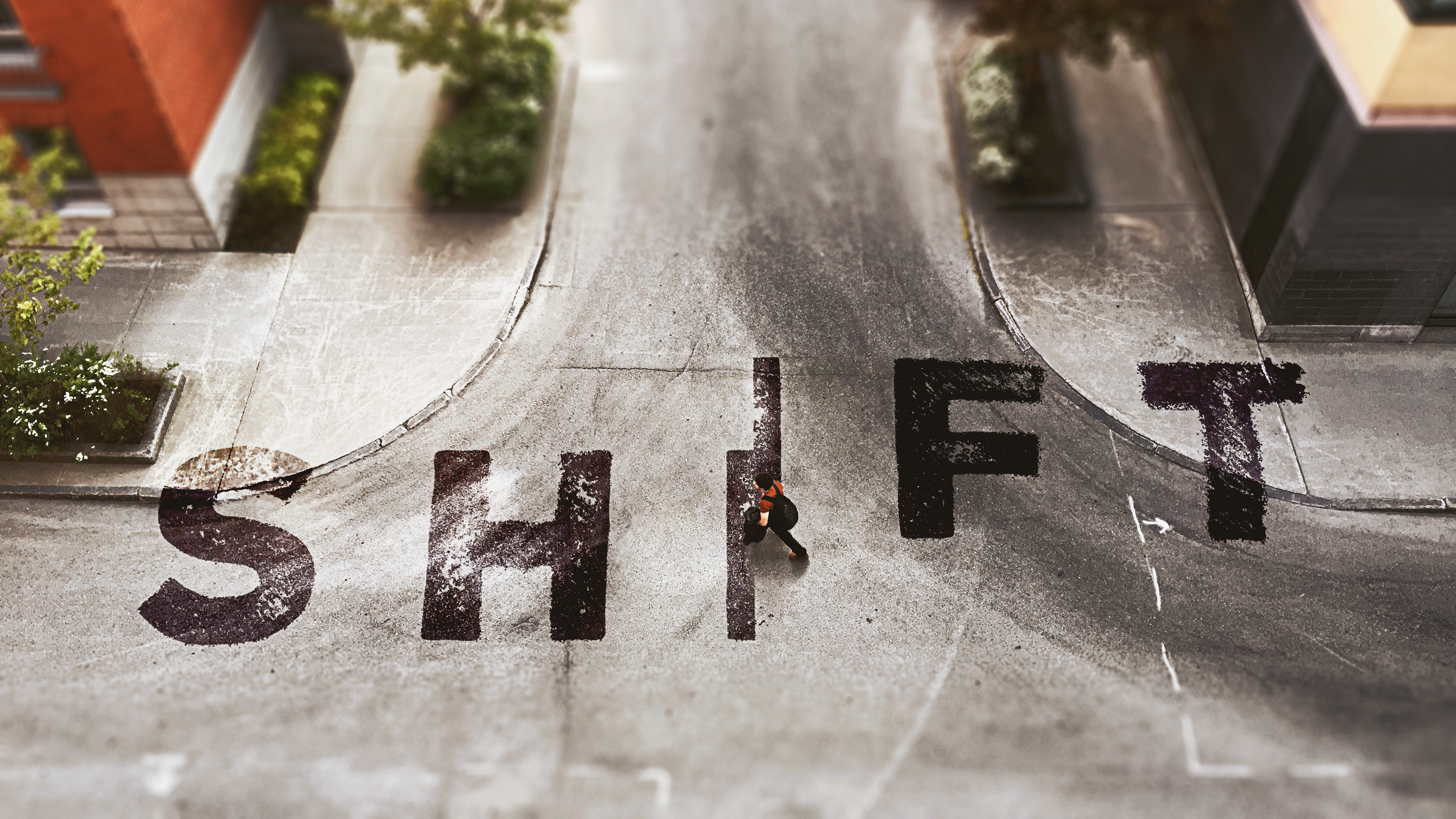
The sermon series title inspired the style: tilt-shift. The photo, courtesy of Unsplash, was heavily doctored in Ps with layered blurs to create that tilt-shift miniature look. The guy was added later and originally wore a blue shirt. I made it red since the blue didn't match the tonality. The "SHIFT" type was laid out in Ai then brought into Ps and then roughened with one of my custom brushes. I duped the photo and made a custom displacement map that I applied to the type. After adjusting the blending mode and splitting the blend sliders for the underlying layer, I got a nice painted-on look.