Mona Hayes Therapy
Brand Identity • Logo Design • Art Direction • Messaging • Copy Writing • Web Design
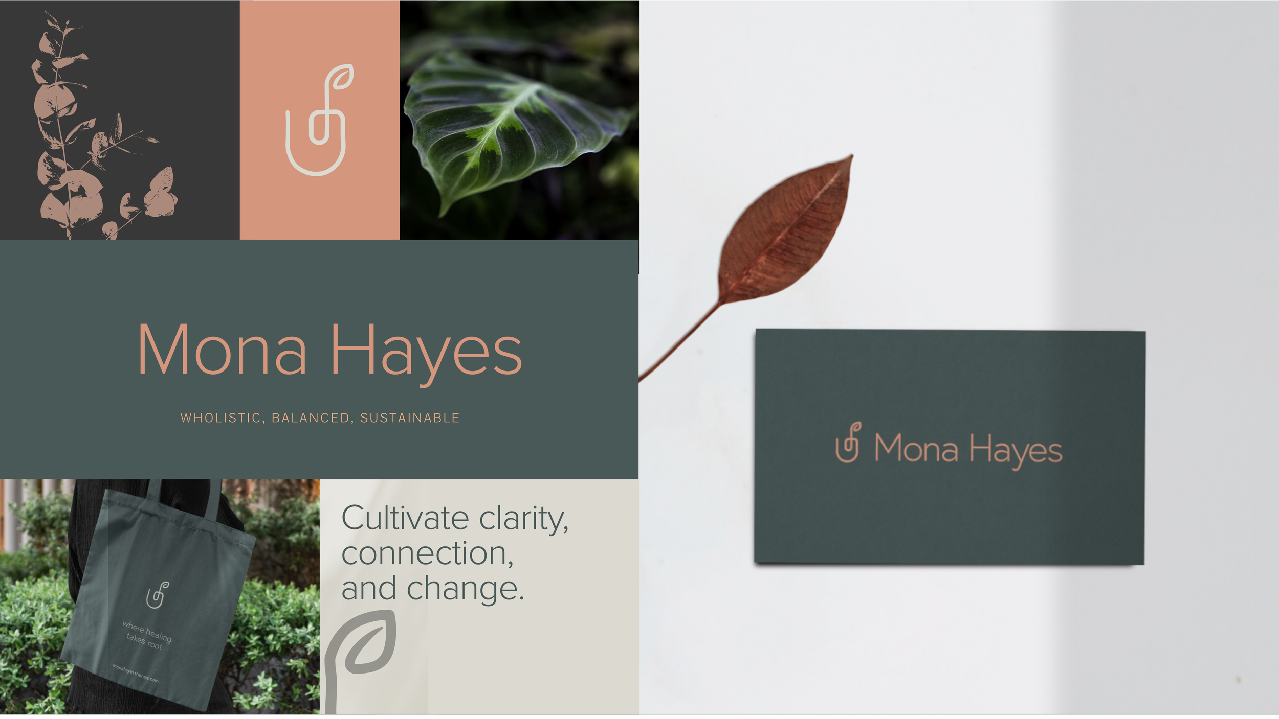
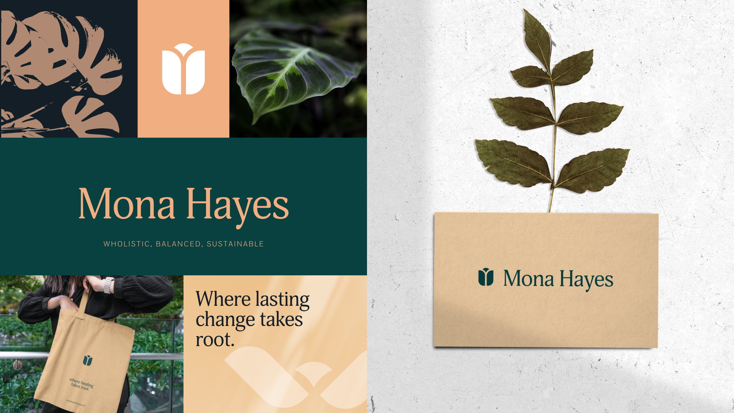
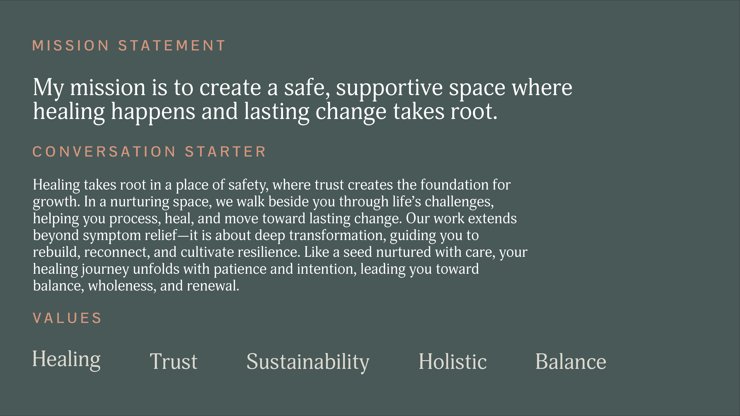
As an LCSW certified in EMDR, Mona’s work is grounded in empowerment. Rather than hand clients answers, she teaches them how to grow—so she gives each new client a small plant: a symbol of care, patience, and transformation
I helped Mona turn years of meaningful therapy work into a brand that finally felt as grounded and intentional as the care she offers her clients. Together, we built a visual identity around her belief in steady, chosen growth, anchoring the brand in warmth, empowerment, and the symbolism of tending something until it flourishes.

Competitive Analysis
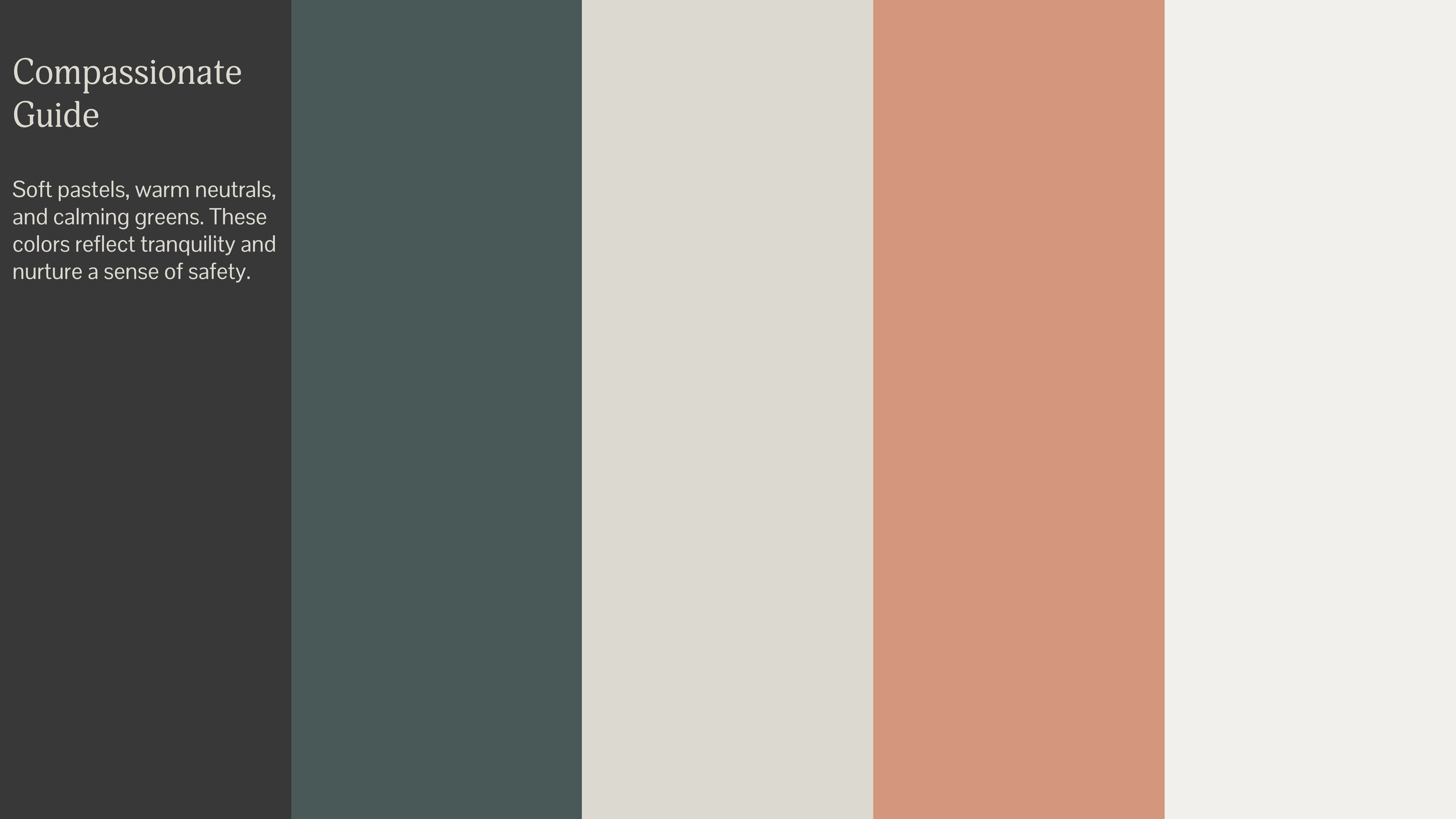
Most therapy sites and brands lean into heaviness and struggle. But Mona is calm, deeply relatable, and emotionally spacious, so I focused on imagery that captures the after—the lightness you feel after catching up with an old friend. I wanted that to show up in her brand.


Brand Directions
The botanical direction felt right becuase of the plants Mona gives away to each new patient: a symbol of growth and care for their journey. I researched plants and their symbolism, looking for metaphors grounded in growth and resilience. The idea of “path” came up time and again whenever Mona and I spoke and we explored directions that exemplified pathways and forks in the road to emphasize the power of choice.